This was a shorter week for me as I took Thursday and Friday off to spend it with the family.
Monday, I did some deep work, so I missed the activity related to the sticker above during that time. But more about that in a bit.
Branding things
We continued no-logo discussions, agreeing that no new service should have any distinct brand identity on its own. In the absence of proper domain management and every Federal government service getting a name.service.bund.de subdomain, the quickly recognisable identifier and visual conveyor of trust must be the ministry’s logo.
You can see that reflected in the existing services for making a simplified tax declaration for retirees and for submitting a property tax declaration. The service names use a typographic arrangement with the regular and bold version of the government’s BundesSans font. The services’ word marks are linked and used as a way to get back to the start page.
After our exchange, I revisited an older blog post from my former colleague Stephen on ‘when design should get in the way’. In most situations, it should not. Users don’t have to know who developed a service. They only need to know it’s real and trustworthy of their data. Currently, the only way to indicate that is by building on the Federal government’s style guide elements and using the logo of the related ministry – and not undermining its visibility with another logo. We’ll continue with that approach for other services and should probably blog about that, too.
On Wednesday, I participated in a naming workshop my colleague Sabrina facilitated. Partially, it was built upon Tom Hewitson’s naming workshop and informed by Rebekah Barry’s deck. For a new service component that’s partially end user-facing, we collected more naming ideas and had about 10 internal participants prioritise the options. It’s always great seeing a designer with strong facilitation skills doing their work.
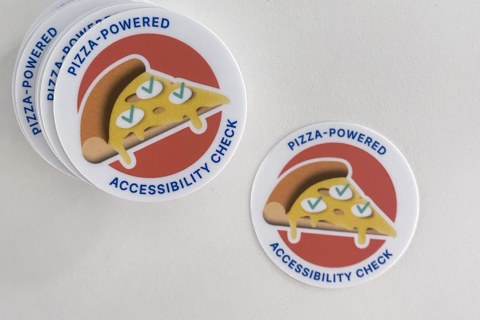
While doing focus tasks on the train on Monday, I missed the second pizza-powered accessibility check. Seven people participated. They found some issues with the newly launched property-tax service and categorised and prioritised them so the team could address those swiftly. As some customer feedback is coming in daily, we are also looking for a couple of part-time student workers to support us.
Daphne designed a fun sticker for the occasion (see above). Every participant in this and the previous session earned one. I made some initial sketches, which Daphne luckily rejected.
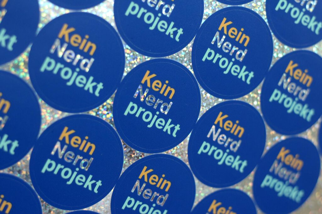
Being in the UK for a few days and having cheaper access to Diginate, the UK #GovDesign folks’ favourite printer, I quickly drew some designs one night.
One sticker picks up former chancellor Angela Merkel’s statement that redesigning services in a user-centred way is “no nerd project”. She made it in a 2018 parliamentary discussion, explaining the budget. The video got a little attention on Twitter then, but not much beyond that.
A second sticker reflects some discussions I had with different people over the years in which the phrase “pragmatic optimist” came up. There are some articles on the internet on being pragmatic and optimistic, applying different lenses. To me, the first is about the achievable. The second is about the hope of a better future. For me, it encapsulates what we do with digital transformation: incremental change for the better.
The sticker is printed on transparent foil, the other on holographic foil to shine through the word ’nerd’.
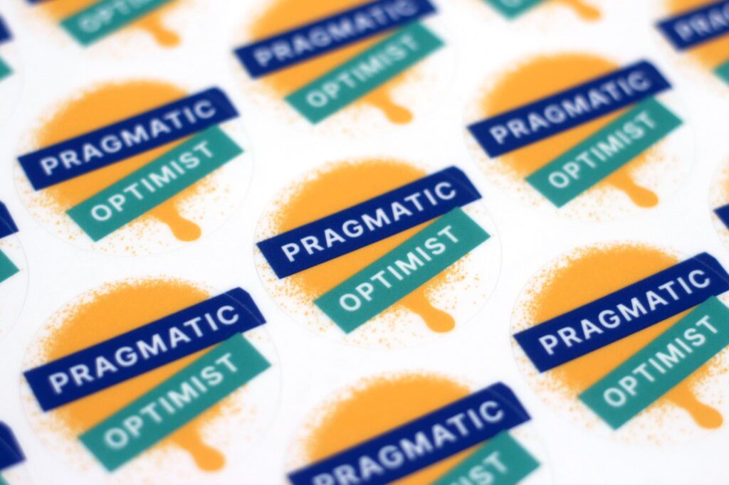
As these stickers are for our organisation and its staff, I relied on the typeface Inter, which we also use on the Digital Service’s website and all other branded material. Daphne did the same for the pizza-powered sticker and last week’s service launch sticker, too.
Talking to more people
I spoke to 4 more candidates on Tuesday and Wednesday while our senior designer role remains open. So, while in the last few months, a few applicants knew me or were acquaintances, the effects of my arrival seem to have faded. And I’m happy about it.
Our application process at the Digital Service consists of 4 to 5 interviews now. So it’s much longer than the simple single interview step for designers we had established at GDS.
We do 1 screener interview of 30 mins with the talent manager, followed by another design screener interview of 30 mins I do. Then, if suitable for the role, we continue with a 90-min design deep dive with the candidate that doesn’t include an exercise but time for discussing previous work from their portfolio.
After that, the candidate has 2 more short interviews with the Chief Operating Officer and our Chief of Staff. So people get the chance to speak to about 6 people from the Digital Service, can develop a sense of our culture and have the opportunity to ask many questions. As we have fewer applications than other bigger organisations so far, this more involved process is doable, But we know it won’t scale forever, so we keep reviewing and changing it.
What’s next
Next week, I’ll finish a blog post on involving users in our work, spend more time on community work and need to make progress on some objectives and key results.