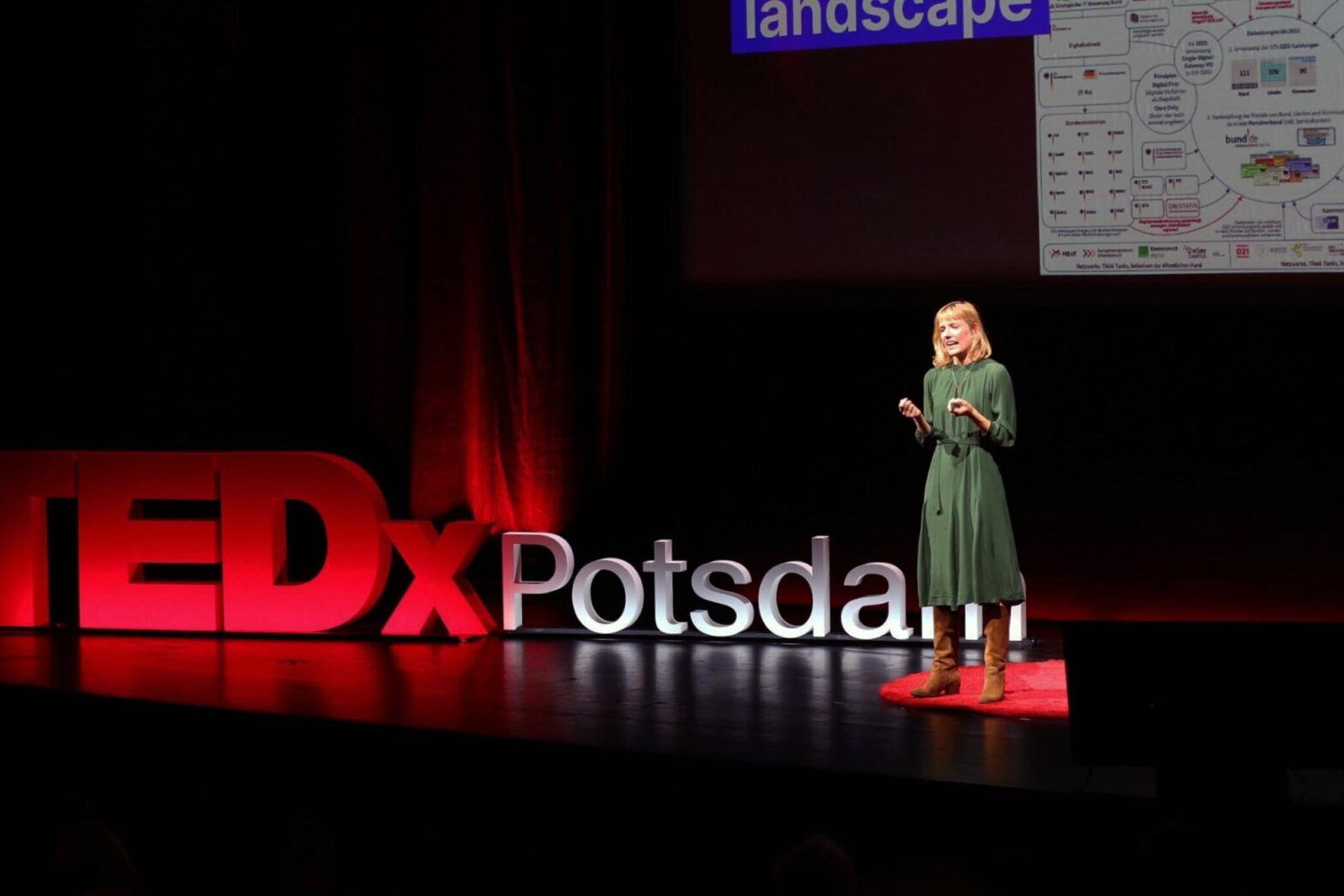
After exactly a week with COVID, I finally tested negative and was able to leave the house. That was just in time for my colleague Charlotte’s TEDx talk in Potsdam on ‘Designing good public services for everyone’. Her talk was 1 of 7 on a wide range of topics. It was well structured and delivered and equally well received.
With her talk, Charlotte demonstrated the difference between a well-written presentation and a compelling personal talk. Both have their place. TED talks are the latter.
In the rehearsals, Charlotte still had a title slide. In the final version, it was gone. She started with a personal statement and didn’t use the slides to guide her through the 15 minutes, but remained in charge and used them. Her words and story led, not the slides on the wall behind her. Charlotte was the protagonist instead of the presentation deck. It was the sidekick, not the other way around.
This was powerful to see. All too often, people allow their slides to drag them through a presentation. They become slaves of their written content. And, occasionally, they get so overwhelmed by the density they fight for attention – while packed slides distract and lure the observer to start reading instead of listening to the presenter.
In the last 2 days before the talk, Charlotte’s slides got adjusted to the environment. The stage is all black. The focus is on 4 elements: the speaker, the red circular rug they are standing on, the letters in the background and the screen in the back. As a last adjustment, the text on all slides is enlarged, and white background elements are turned black wherever possible – not to draw unnecessary attention. These interventions are small, but they put the emphasis and focus where it should be. The story and its narrator are leading; everything else steps back.
Although nothing was new, it was a great reminder of what good looks like. For years, I used to be a strong advocate of all-black slides, for example – over a decade long before dark modes became fashionable. So, for next week’s talk at the Smart Country Convention, I’ll see what I can borrow from this TED experience.
Kicking some things off
While operating at a reduced capacity this week, I still managed to contribute to a few things.
On Tuesday, I participated in a workshop on illustrations to match the brand values and styles defined by the Federal government’s style guide and brand book. Agnieszka, Daphne, and Marlene led it during our design and user research weekly. And we had a colleague from the Federal Press Office join us for it, too.
Part 1 of the workshop was a playback from 2 projects in which designers explored the use of illustrations – our digital identity app BundesIdent and the new justice services we are currently building. Agnieszka and Marlene spoke about the considerations, the various directions and styles they tried, and the various routes they discarded.
Part 2 of the workshop was interactive. Through 8 sliders, everyone was asked to describe 7 different illustration styles collected from international government websites. The sliders had labels like emotional and playful vs. explanatory, informative and scientific. Another slider was labelled intricately and elaborate vs. sketchy and fast. In many dimensions, a dozen designers were aligned. In some, they couldn’t agree at all. In the final part, they were asked to determine a suitable style for our justice services in the making.
The biggest remaining gaps at the end of the workshop: Should the illustrations be abstract or naturalistic? Visually friendly and approachable or rather formal and serious? Should they be generic or have their own narrative power?
We’ll need a few more rounds to clarify and agree on the answers to those questions. We will use upcoming usability and accessibility tests with disabled people to understand which illustration styles work best with users with cognitive disabilities.
Later on the day, on Tuesday afternoon, engineer Merlin helped get colleagues from 3 disciplines together, who have an interest in co-running our monthly ‘Introduction to Accessibility’. So far, it’s been Nadine and I running these. With holidays, sick days and conflicting duties, it needs a smaller group who can run these onboarding sessions. We reviewed the content, discussed a rota, and briefly touched on additional future formats, too.
On Friday, we kicked off the first mid-level user research role. We are planning to open and advertise it soon. Like the first senior content designer role, the position is for our justice services platform, where plenty of work is ahead of us in the new year.
A few days earlier, we had our monthly cross-government user research exchange. We heard that more user research roles are in the making, which is encouraging. We see significant interest in public sector design and user research roles, so it’s fantastic to see more opportunities arising.
What’s next
On Thursday, Caro and I will be talking about the Service Standard at the Smart Country Convention. It will be the last in-person talk for this season, and I am glad about it. I will have a few more events in the coming weeks going into December.
There’s enough to finish this year. Our international 24-hour conference will be a big thing. And so will be the Public Service Lab Day we are running in the middle of the month in Cologne. I will be busy preparing these with my respective co-organisers in the coming week.
We also started advertising our last NExT user-centred design community event for 2023. The topic will be ‘Plain language and straightforward administration’. I’ve reached out to people writing content in local and state-level government.