This week, I was on annual leave.
Supporting a sprint remotely
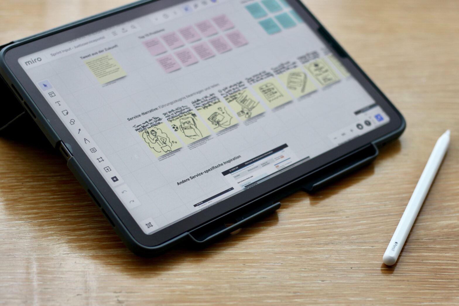
I did share some scribbles and notes with my colleagues Marco and Stefan at the beginning of the week, though. They ran a compressed design sprint-like activity for 3 days to plot a platform strategy for justice services.
As they asked for input last week, I sketched a short service narrative, wrote a few ‘how might we’ questions and composed a tweet from 5 years into the future and noted known pain points within today’s fragmented service landscape. I also offered some references to a couple of 2-sided GOV.UK services, where there are 2 different types of users connected to a service.
Keeping eyes and mind open
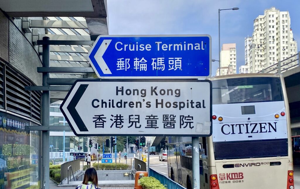
Otherwise, I enjoyed time in Hong Kong and Macau. I was delighted to see the bilingual road signs again. As a former British colony, Hong Kong uses an extended variant of the British road signs developed by Jock Kinneir and Margaret Calvert, incorporating ‘Transport’ as a Latin typeface. The traditional Chinese character set seems to be of a different font, though. It would have been good to see consistency there.

I also collected some of the huge variations of departmental logos of Hong Kong government departments. They all seem to be created in different periods, following different design languages and styles. This is where the German government, at both federal and local levels, has matured and embraced consistency. For some reason, this doesn’t extend to domains, which is what Hong Kong does well with its .gov.hk top-level domain. Once again, there is much to learn and copy from others to improve public service offerings.
From the days before brand strategists emerged: Hong Kong’s city departments have a wonderfully diverse brand language that probably spans a few decades of design languages.
— Martin Jordan (@martinjordan.com) Feb 16, 2024 at 10:24
[image or embed]
What’s next
I will keep vacationing next week. I might open a work-related book. Or I might choose not to.

