
It’s good to have a break. But when an opportunity arises, it can also be valuable to take a break from a break.
As I was in Paris in the second part of the week anyway, I reached out to colleagues at the OECD. I had followed some of their work streams for some time and was curious to hear more. So when there was a sudden chance to catch up in person, I used it.
Discussing how we assess service quality
Arriving at the OECD headquarters, I got to see the historical Château de la Muette, Marie Antoinette’s hunting lodge. We had a few minutes to pose for a picture. The remaining time we wanted to use for the actual matters that mattered.
We had a total of about 90 minutes. I was curious to learn about 2 distinct yet related work streams: a citizen satisfaction survey that is currently underway and the sludge audit work. The colleagues, Emilie and Eva, kindly gave an overview of their work.
The 10-country survey has been conducted across 15 life events across the European Union, from Austria to Estonia to Spain. One unsurprising conclusion is that “satisfaction with administrative services is a key driver of trust in the civil service and in governments”. The survey was structured around the users’ journeys. It covered how people discover, access, and navigate services – and how they are getting what they came for, as well as how it matches their expectations. The survey included 1,500 users and 500 non-users per state.
The more services people need to interact with, the worse their experience gets. This is also not a surprising finding. It’s the reason why we have worked towards end-to-end service design for almost a decade. Having data points to prove the impact of the fragmentation of services is powerful. The satisfaction drops by 30 percentage points when 5 or more touchpoints are part of the journey.
According to the survey, 9 key drivers were identified. When considered, they lead to overall user satisfaction with services. Again, none is surprising. The 9 drivers are:
- Proactive services
- Accessible services
- Clear services
- Seamless services
- Integrated services
- Simple services
- Fast services
- Fair services
- User-centred services
With more work happening in this space, I am eager to stay closely to this work stream, as it tightly links with our service work in multiple areas. A workshop is scheduled for early December, which I plan to attend.
The second area of work discussed is on sludge audits. It’s a behavioural science approach to identifying the barriers to good service, based on the work of Cass Sunstein. Much of the work has been led by OECD colleague Eva, who was still working for the New South Wales (NSW) government at the time. Over 100 sludge audits have been conducted globally over the past 5 years. Finland alone is currently running 20 active audits. The OECD has adapted the NSW sludge audit model into a broader international approach with a wider focus, including trust and satisfaction indicators.
In a sludge audit, the user journey is divided into steps, which can range from 5 to 25 steps, depending on the service. In the example presented, I looked at a 5-step journey, one step being ‘reading a website’. Such step would be then analysed for its design, language, and content aspects. The aspect language would be assessed against different sludge scale elements like readability, tone or level or personalisation on a 5-point Likert scale from ‘very difficult’ to ‘easy’. The time required to complete each step is also a critical metric.
There is a digital sludge audit tool in New South Wales; the OECD is developing its own version. One thing I was glad to learn is that the approach incorporates existing user research and service design data into the audit process. Apparently, this is modelled in Finland, where the government design community Julkis-muotoilijat is deeply involved in running the sludge audits. I am curious to hear more from them about their experience. Importantly, any team – including service operations staff – are supposed to conduct a sludge audit.
One thing I was delighted to hear is that there has been strong demand for sludge assessments, with minimal resistance from participating governments. I am curious to see how this will be perceived in Germany.
While representing very different abstraction levels, the citizen satisfaction surveys and sludge audits provide a helpful mixed-methods approach to measuring the quality of service and systematically identifying pain points. The surveys capture broad user sentiment, while the sludge audits offer granular insights into service friction. Combined, they can strengthen understanding of trust, satisfaction, and usability across government services. Hence, I am eager to learn more about these approaches and help bring them closer to our German government service context. This 90-minute was an excellent starting point for me. I look forward to what’s next.
Doing accessibility bug busting for the Service Standard website
It’s been 3.5 years since we started running pizza-powered accessibility checks. We started them in May 2022 and have run them ever since. This time, we took a closer look at servicestandard.gov.de.
That was particularly necessary, as the actual development of the web offering is not within our control. A contracted development company that works on various parts of openCode is tasked with providing the frontend for us, while we handle the content in the open repository.
We tested the web offering along the GOV.UK Accessibility Personas with our Chrome extension ‘Simulating accessibility personas’. For the first time, we had external guests join us and participate in the test: 3 colleagues from CityLAB Berlin.
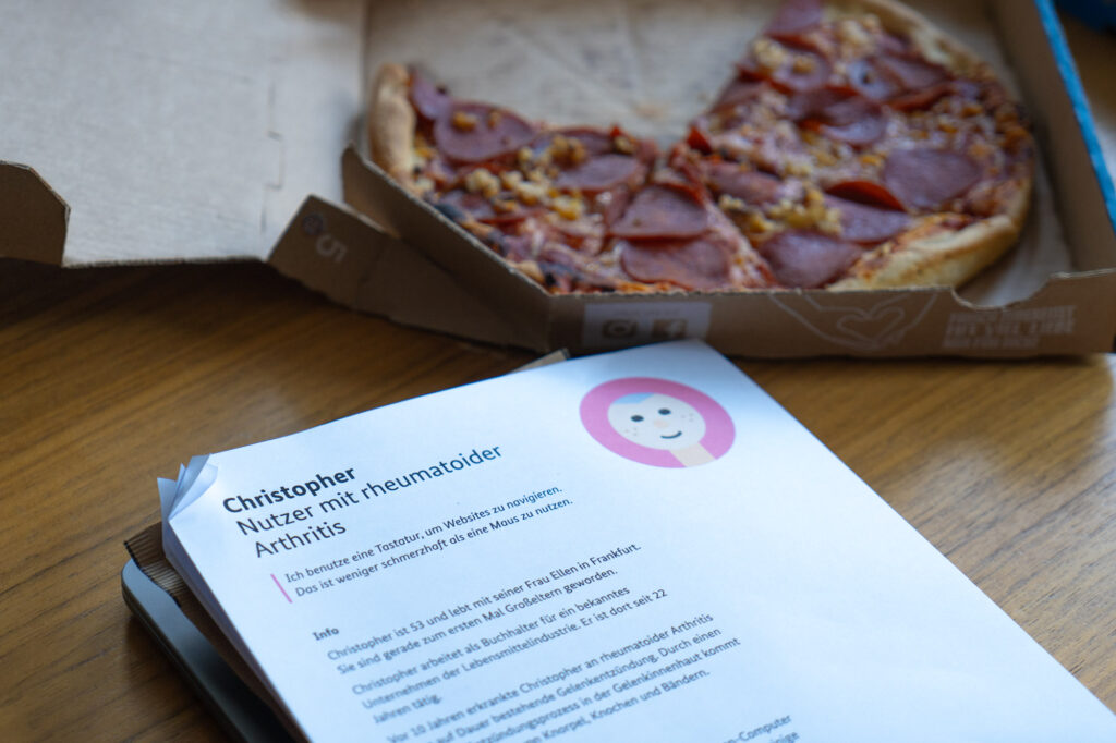
As the format permits, we ordered pizza and tested servicestandard.gov.de with the 6 personas. I was in charge of looking after accessibility persona Claudia, who is sight-impaired, uses a screen magnifier, and changes colours to increase contrast. Ed, my testing participant from CityLAB, discovered multiple errors and mistakes. We tested on a Windows PC with high-contrast mode activated. Icons disappeared, the styling of buttons and labels was gone, and the spacing between paragraphs was off. This led to a subpar user experience. The website was more complicated to navigate, and the content became more difficult to engage with.
The other tester-notetaker pairs identified further issues for their respective personas, which we will need to address in the coming days before conducting an external accessibility assessment. It’s always good to run internal checks before.
Hosting a meetup on visualising data
On Tuesday night, we hosted our 11th public-facing meetup.
On Sunday evening and Monday night, I designed the poster, which I had sketched on paper the days before.
Tonight, we’ll discuss ‘Visualising data’ in our 11th #ÖffentlichesGestalten meetup—jointly run by @digitalservice.bund.de and @tsbberlin.bsky.social’s CityLAB Berlin. We’ll hear from @moritzstefaner.bsky.social and Thanh Thu Nguyen and get to see their data visualisation work for the public sector
— Martin Jordan (@martinjordan.com) October 21, 2025 at 10:47 AM
[image or embed]
Using actual stats on trust in government, I designed 4 graphs. I picked the types of graphs so that – from afar – you could read the word DATA. It was well received, even though it made no impact in awareness-creation anymore. The event was already fully booked, and people kept reaching out to me to confirm their additional spot.
We eventually had about 70 people join us. They enjoyed our 2 speakers’ talks as much as we did. Personally, I wanted to hear more about the work our speaker, Moritz Stefaner, has done for the Federal Ministry of Health and the Foreign Office for years. If no one else had been interested in this topic, I would have organised this event just for my own benefit. Luckily, there was significant interest, with all seats sold out in just 3 days.
The room was packed, and we reached maximum attendance for our mezzanine space. The feedback we received has been very positive. Attendees gave the event a 4.9 out of 5-star rating.
What a packed event last night—about 70 people joined for inputs and discussions on ‘visualising data’. First, we heard from @moritzstefaner.bsky.social about his work for @diplo.de and @bmg-bund.bsky.social. Then, Thanh Thu Nguyen presented her work at @udkberlin.bsky.social on facial recognition.
— Martin Jordan (@martinjordan.com) October 22, 2025 at 9:43 AM
[image or embed]
In the coming days, I will likely edit the recordings during further long train rides and make them available on YouTube.
What’s next
As our design system blog post is ready to go, I hope we can complete any editing work in the coming week. Therefore, it may still be published in October.
I will also do further planning for another international call that we intend to run in early November. It will be on service patterns. As there is much to cover, we will have to run it in 2 parts.
With the rush, we are trying to wrap up the second Service Gazette issue of the year. We are late with everything once again, but we should still be able to succeed.