That was another short work week, allowing me to spend more leisure time in London with reasonably pleasant weather. Among other things, I used it to train more for the company run next week.
Measuring things
As the second quarter comes to an end in a few weeks, we started reviewing the objectives and key results (OKRs) in the organisation. Those exist for the organisation, all product teams, non-product teams, and also cross-discipline functions.
The process and approach are still iterated at multiple levels of the organisation, but after two rounds, it already feels reasonably mature. The OKRs at the organisational level are linked to the Digital Service’s mission.
My colleague Sonja recently spoke about our approach to OKRs. And we should blog about our experience and learning soon, too, cause it’s well worth more exchange – especially in other parts of German government and the public sector.
One of the cross-functional objectives is to make core company goals and metrics transparent for everyone in the organisation. Practically, that includes setting up dashboards and measuring relevant key performance indicators in each discipline. For design, we discussed what that means.
The one we decided to start with is user research activities across product teams. I want everyone in the organisation to see how much we are in touch with the users of the things we are developing. The aim is not to increase the metric indefinitely but to ensure we get user input regularly. We should be able to collect the retrospective data for 2022 in the coming days and establish a base line.
Learning about accessibility in Germany
Accessibility is not optional for public sector websites, apps and online services. Therefore, everyone in the organisation – or at least in product teams – needs to know about it. So on Thursday, we had an excellent 2.5-hour introductory training run by Sozialhelden, a Berlin-based non-profit organisation.
The session included a screen reader demo, some inputs and time for questions. In it, we learned how German accessibility is different from the related EU Directive.
Blogging again
In the remaining days, I finished the first general design blog post with the design team’s help. As we haven’t spoken about what design actually is to us, what range of design we mean (graphic design to interaction design to service design to policy and systems design), and what designers do, we need just that.
We’d like to write many other specific blog posts, but we have to start with the basics. The audience is twofold: people in public administration who only have a vague understanding of what we mean when we say design. And people who are designers working in the private sector and not sure what our design approach looks like.
The draft now contains the views of 5 designers and should be out at the beginning of next week. By having multiple views from designers at DigitalService, we give an insight into designers’ motivations and considerations for design in our organisation. That matters as we are recruiting and must reach far beyond our circles and networks.
For broad blog topics, finding a suitable image is the hardest. A few months back, when wrapping things up at the Cabinet Office, I reviewed the photos created and used on the UK’s Design in Government and Services in Government blog. I identified 3 main archetypes:
- Closeup of something
- A service screen or slide on a device with a few props
- Multiple people in a room
In addition, a few blog posts had graphics and illustrations.
The aesthetics of the DigitalService’s website are a bit different. The main photographer created very bright photos with lots of daylight and vibrant but also colder colours. I’m unsure if I’ll match them.
For the blog post, I tried to find German-language tools that help determine the reading age and complexity of the language. I looked into the Flesch–Kincaid readability test to check how difficult a text is to understand. I need to spend more time on understanding how we might be able to use tools like that for content design and making sure the language of services is consistently clear and straightforward.
Planning international activities
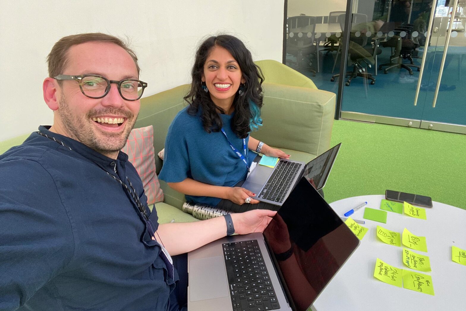
Thursday evening, Paloma and I had the chance to meet in person and plan activities for the International Design in Government community. We have sorted all topics for the monthly calls, looked into community activities and meetups, and prepared a new format for engagement and knowledge sharing.
Via Mega Mentor, I also spoke to someone working with Thailand’s new policy lab and hope we can invite someone from there to a call later this year.
Looking sideways, I found the published version of the UK government’s digital and data strategy for 2022 to 2025 remarkable in a few ways.
The strategy also includes new skill digital requirements for Senior Civil Servants in the UK. They must acquire digital, data and technology essentials, an innovation mindset and take a users-first approach.
From that section:
I understand that users are at the heart of what government does, and I encourage user research to understand user needs.
I understand that government digital services must be carefully designed to meet user needs. I recommend researching user journeys to provide a joined up experience.
I understand that public sector services must be accessible to all users, and I ensure that accessibility regulations and best practice are followed.”
— from the ‘Digital, Data and Technology essentials for senior civil servants’ guidance, published 31 May 2022
I had the chance to feed into this back in late winter when my colleague Barbra developed it. I now wish something vaguely similar existed for Germany, too, as digital literacy among senior public servants isn’t where it should be.
What’s next
Next week is the Berlin company run, our organisation’s summer party, and we’ll have public sector essentials talk.

